BUS220 - Business Intelligence and Analytics | Week 6
Oleh Omelchenko
2026-04-20
Dashboards are built around workflows
Monday morning, 15 minutes before standup
You’re a regional manager. You need to know:
Are we hitting target this month?
Which stores are underperforming?
Is the new product launch getting traction?
Did returns spike last week?
No single chart answers all four. You need a coordinated set of views that lets you assess the situation and decide what to do.
What makes dashboards different from charts
Single chart
Dashboard
One focal point
4-8 views competing for attention
Answers one question
Supports a sequence of questions
Static once built
Interactive elements create new failure modes
The design challenge shifts from “make this chart clear” to “make this collection of charts tell a coherent story, with the right view getting attention first.”
Explanatory vs. exploratory
Two communication modes
Explanatory
You’ve found something. You guide the audience to a conclusion.
You control the order and emphasis
The narrative is curated
The main question: “So what?” — what action should the audience take?
You give users tools to answer their own questions.
The user drives, not the designer
Flexible: filters, parameters, drill-downs
The main challenge: signposts — how does the user know what they can do?
Marketing analysts investigating campaigns, finance teams exploring cost variance.
The “So what?” test
Questions to ask yourself when building explanatory work:
Does my message have more than one part? If so, which charts tell each part?
What do I want the audience to take in first? What order should I tell the story?
What is the most important takeaway, and how can I make sure they remember it?
Why is my message important? So what?
If you can’t articulate what action your audience should take, the dashboard is incomplete.
Signposts for exploratory work
Notice the instruction panel on the left. When a dashboard is interactive, users need cues about what’s clickable — signposts. Written instructions are clear, but take space.
Signposts: symbols instead of text
Interactive key with symbols — compact, scales across dashboards:
Notice the small key at the bottom left: icons for click-to-filter and hover-to-reveal. Less text, same information — but users need to learn the system.
If you produce work regularly for the same audience, use the same symbols consistently so interactions become intuitive over time.
What a dashboard actually does
Think about a car dashboard: it monitors conditions and facilitates understanding. Business dashboards do the same two things.
Monitoring — is everything OK right now?
The most frequently checked information should be largest and most prominent, like the speedometer on a car.
Facilitating understanding — why is something happening?
Charts that provide context, breakdown, comparison. This is where interactivity earns its place.
A KPI row with contextual numbers and trend indicators:
The user checks this in seconds. Trend arrows answer “up or down?” before you read the numbers.
Layout as information architecture
The newspaper front page
A well-designed dashboard works like a newspaper:
Headline — the most important thing, big and prominent → KPI summary row
Key stories — enough detail to understand the situation → main charts
Supporting context — for readers who want to go deeper → detail tables, secondary views
The information design principle behind this: overview first, zoom and filter, then details on demand (Ben Shneiderman).
Layout skeleton
KPI 1
KPI 2
KPI 3
KPI 4
Main trend chart “Where and why?”
Breakdown chart “Which segment?”
Detail table / secondary views “Show me specifics”
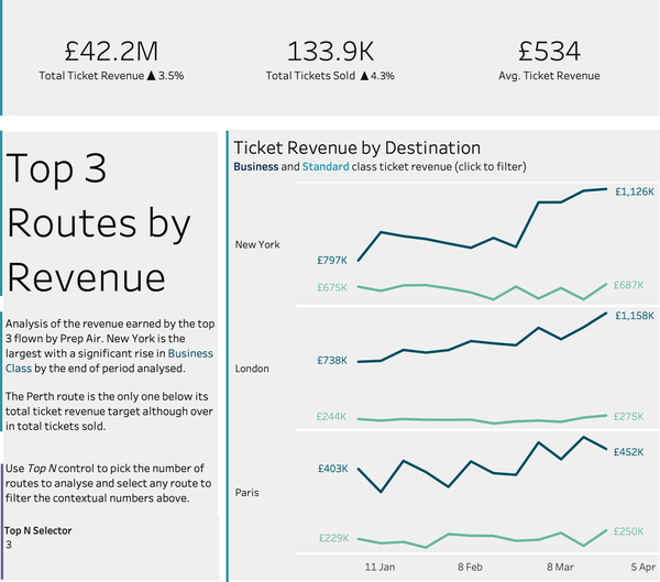
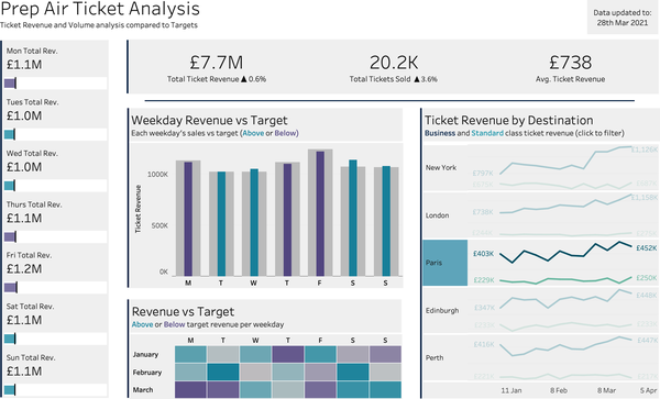
A real example: Prep Air ticket analysis
Trace the layout: KPI row at the top (headline), daily revenue sidebar on the left, weekday bar charts and target heatmap in the center (key stories), revenue by destination on the right (breakdown). Overview → detail, top to bottom.
The Z-pattern
Without explicit visual cues, eyes move in a Z-pattern: top-left → top-right → diagonally down → bottom-left → bottom-right.
KPIs at the top where the eye lands first. Filters in the left sidebar, found before the data. Main charts in the center and right, following the natural reading flow.
Dashboard grouping with spacing
Charts about revenue — grouped together by proximity:
Revenue trend
Revenue by region
Charts about customers — separated by white space:
Customer segments
Retention rate
No borders needed. Spacing alone creates the grouping.
The white space between the revenue and customer sections tells the user: “These are different topics.”
The tight spacing within each group tells the user: “These are related views.”
Common layout mistakes
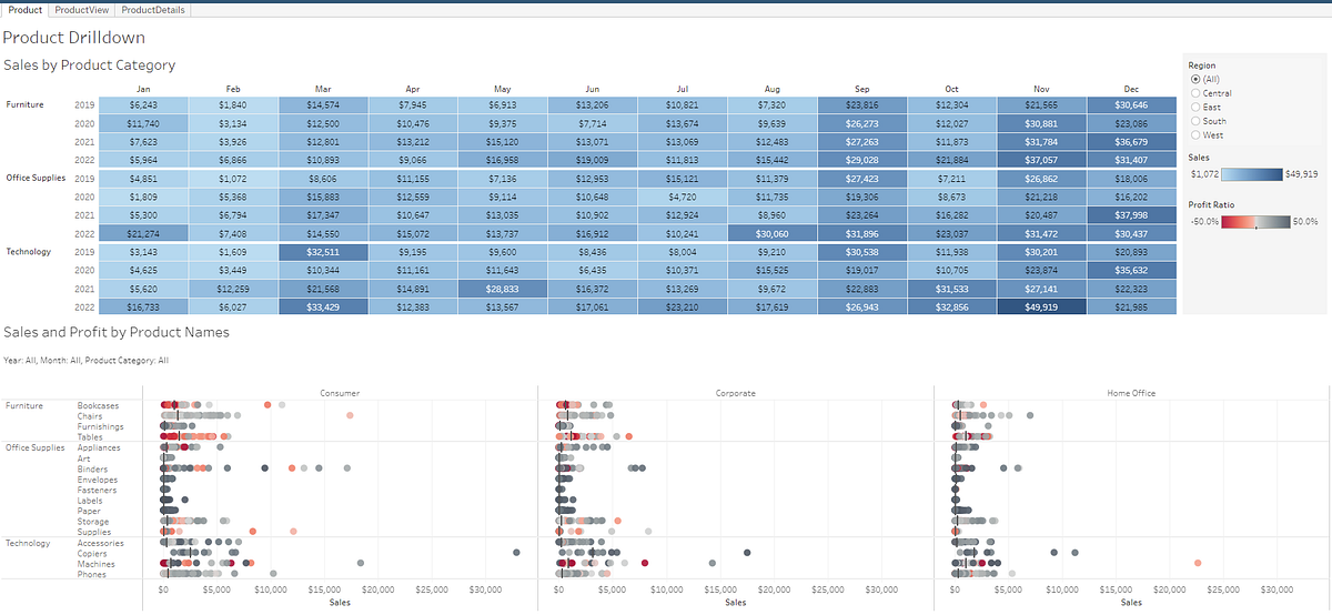
Every available view crammed onto one page. Tiny text, no hierarchy, no entry point.
Mistake
Fix
The data dump
If you need 12 views, use 2-3 pages
Filters at the bottom
Filters go at the top or in a sidebar
No grid
Use a consistent column grid
No visual hierarchy
The most important view should be the largest
Exercise: sketch a dashboard layout
A parcel delivery company’s regional manager checks a dashboard every morning. They need to answer:
How many parcels were delivered yesterday vs. the daily target?
Which distribution hubs are falling behind on delivery times?
What’s the trend in customer complaints this week?
Are any vehicle routes consistently over capacity?
Sketch a rough layout — just boxes and labels.
When interactivity helps vs. when it hurts
The interactivity spectrum
Static report
Light interactivity
Heavy interactivity
Controls
None
1-2 (metric switcher, date filter)
Multiple filters, drill-downs
Audience
Specific finding for a specific audience
Same analysis from different angles
Analytical users investigating freely
Cognitive load
Low
Low
High
More interactivity means more flexibility but also more cognitive load. The mistake is defaulting to heavy interactivity because the tools make it easy.
Tableau lets you add 20 filters in 5 minutes. That doesn’t mean you should.
Good interactivity reduces cognitive load
1. The metric switcher (parameter)
Instead of three separate charts for Revenue, Profit, and Orders — one chart with a parameter control. The user sees one clean view at a time. A parameter used well is a decluttering tool.
2. Cross-filtering (dashboard action)
Click a region on the map, and the bar chart updates to show only that region. Two views working together — overview provides context, detail provides specifics.
3. Highlight action
Hover over a category in one chart, and the same category lights up across all views. The user traces a dimension across perspectives without losing the overall context.
Good interactivity in action
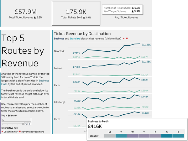
The Prep Air dashboard you saw earlier — now the user clicks on Paris:
All destinations
Filtered to Paris
Same dashboard, one click. The KPIs update, the charts narrow to Paris data. The layout stays stable — nothing jumps around.
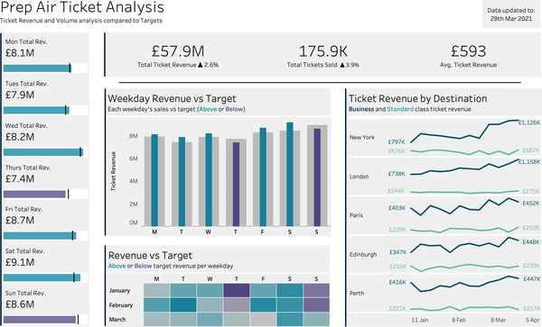
The question chain
One dashboard, four questions answered through interactivity:
What’s overall revenue? → check the KPI row → on track
What about Paris, our new route? → click to filter → below target
Are there weak days of the week? → read the heatmap → Mondays
Is this a new pattern or ongoing? → compare months → started in March
Each interaction answers a natural follow-up question. The user follows a thread, not clicking randomly.
Bad interactivity: the filter wall
Long checkbox lists for currency and country. The sidebar is bigger than the chart.
Dropdowns for rarely used filters, checkboxes only for the ones that matter. Same data, less friction.
Bad interactivity: the invisible interaction
A filter action fires when you click a bar, but nothing indicates the bar is clickable. The user either never discovers the interactivity or is surprised when the dashboard suddenly changes.
This is the signposts problem: if an interaction isn’t obvious, it doesn’t exist for most users.
“You know where the color legend is because you put it on the dashboard. You know what to click because you coded those interactions.” — But the user doesn’t know any of that.
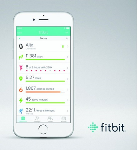
The zombie dashboard
This Fitbit dashboard was motivating at first — it answered questions, changed behavior, helped form new habits.
After a year, the questions had evolved: What were my best days ever? How does activity vary by weather or work schedule?
But the dashboard hadn’t changed. Same step count, same layout, day after day.
“My goals and related questions were changing, but Fitbit’s dashboard didn’t.”
Dashboards that don’t evolve become zombies — updating daily, answering questions nobody asks anymore.
The three-question test
Every interactive element you add should pass:
1. Is it discoverable?
Will the user notice this control without being told? Use signposts: labels, icons, or a small interactive key.
2. Does it answer a “So what?”
What business question does this filter serve? If you can’t name the question, the filter probably shouldn’t be there.
3. Will it still matter in 3 months?
Build for questions users will keep asking. One-off investigations belong in a separate analysis, not on the permanent dashboard.
Exercise: audit a familiar dashboard
Think about the dashboard you built in week 4-5 practice, or the executive dashboard you read about in week 4.
What interactive elements does it have?
Do they pass the three-question test?
Which elements would survive the 3-month test?
Visual design at the dashboard level
Color consistency across views
Inconsistent
Technology is blue in one chart, green in the other. Two palettes = two things to memorize.
Consistent
Blue = Technology, red = Furniture. Everywhere.
Practical tip: assign colors at the data source level in Tableau (Edit Colors → Assign Palette). Don’t rely on automatic assignment — it shifts when you add or remove dimensions.
Visual hierarchy across views
Equal sizing = no hierarchy
Chart A
Chart B
Chart C
Chart D
“Everything is equally important” — which means nothing stands out.
Sized by importance
Main analysis
Support A
Support B
The eye goes to the largest view first. Size reflects priority.
Conditional formatting in KPI rows
Without conditional formatting
$1.2M Revenue
8.2% Margin
342 Returns
Which one needs attention? You have to read all three.
With conditional formatting
$1.2M ▲ 3.5%
8.2% ▲ 0.4pp
342 ▼ 28%
Returns jumps out immediately — preattentive processing at work.
Decluttering at the dashboard level
SWD Ch 3’s decluttering process applies to each chart. At the dashboard level there’s an additional layer:
What to check
Why
Redundant axes
Two charts with the same time axis side by side may only need labels on one
Multiple legends
If three charts use the same color encoding, one legend covers all of them
Repeated titles
If the dashboard title says “Sales Performance by Region,” the chart title “Sales by Region” adds nothing
Over-labeled KPI row
If a KPI card shows “$1.2M Revenue,” the bar chart below doesn’t also need an axis label saying “Revenue”
Each removal reduces the total number of elements competing for attention.
Today’s takeaways
Dashboard design starts with the audience’s workflow.
Know whether you’re building explanatory or exploratory — it shapes every design choice.
Layout is information architecture: overview first, then detail.
Every interactive element should pass three tests: discoverable, answers a “so what,” survives 3 months.
Visual design at the dashboard level means consistency across views, hierarchy through sizing, and removing redundancy.